How I led the SafePay integration into JPMorgan's Payment Design Library — aligning a dozen banking teams around a single, coherent payment experience.
SafePay — JPMorgan's digital wallet — needed to be integrated into the Payment Design Library (PDL), the shared component system powering payment experiences across the bank. On paper, it sounded straightforward: add a new payment method to existing flows.
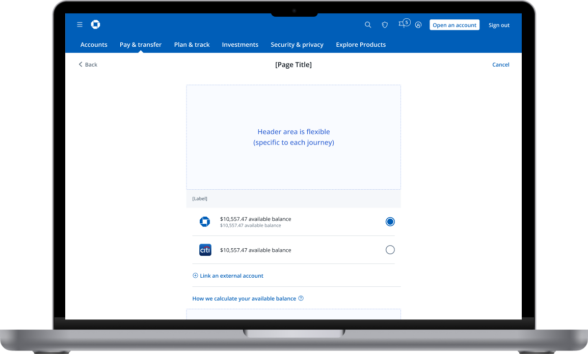
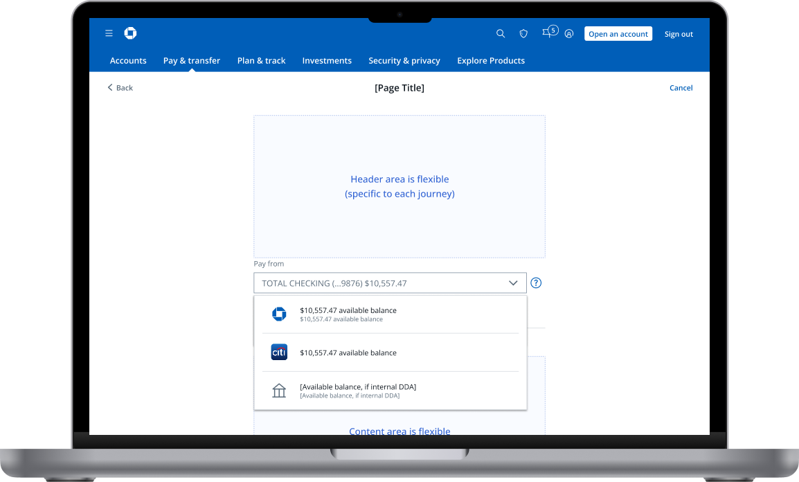
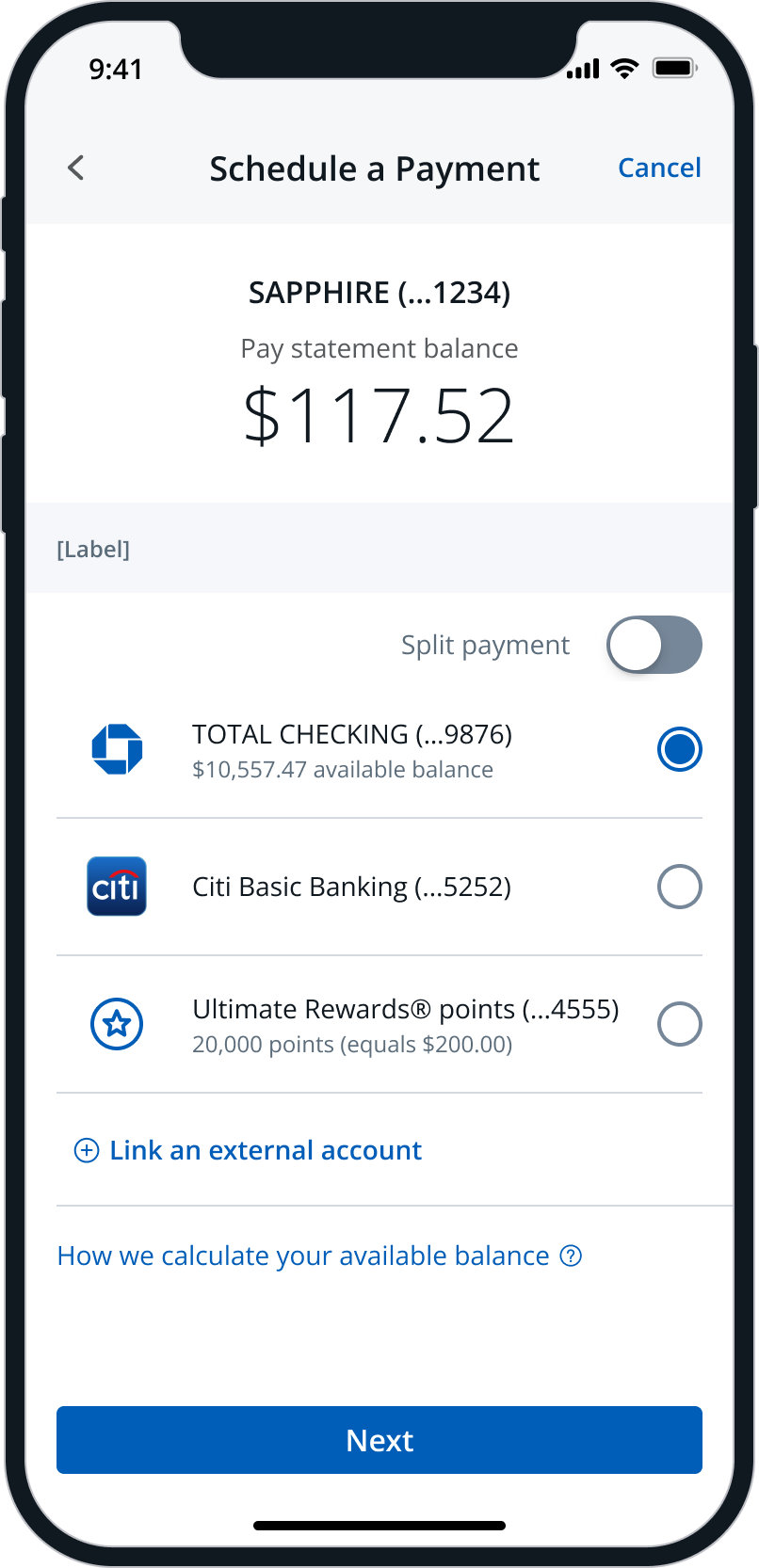
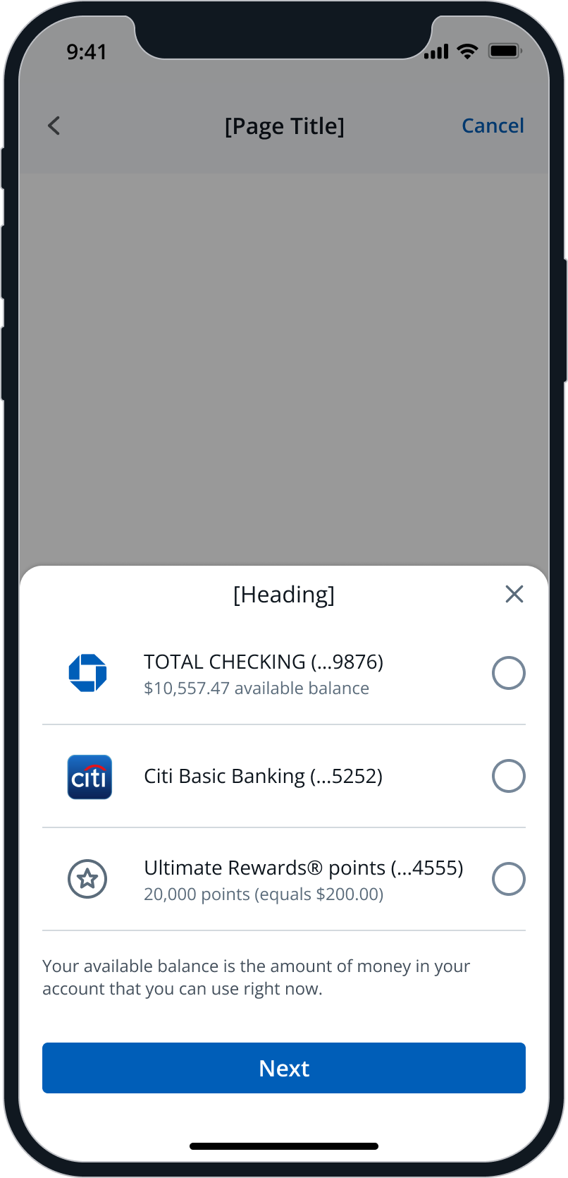
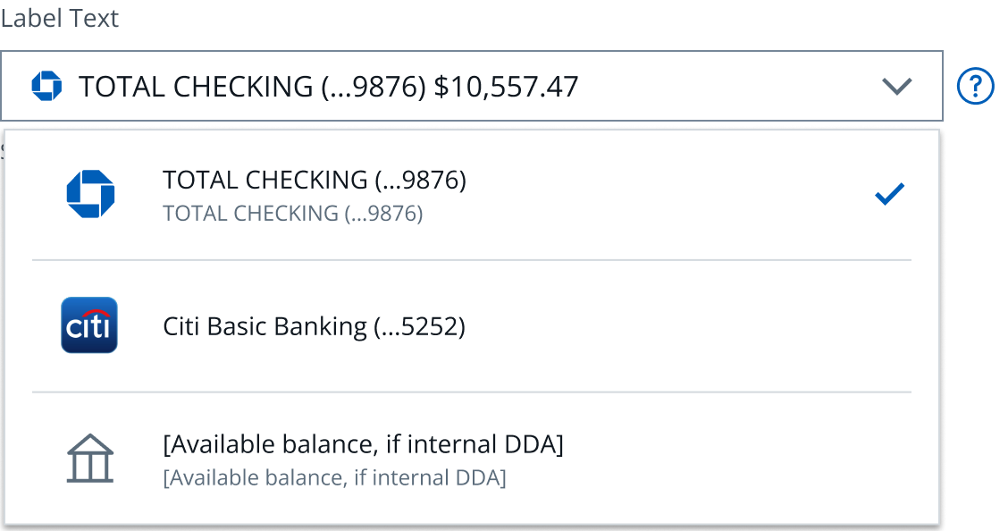
In practice, it was an alignment problem masquerading as a design problem. Each banking team owned a piece of the payment journey and had developed their own conventions. Dropdown behaviors differed. Payment method categorization varied. Balance surfacing was inconsistent. And nobody agreed on where "Link External Account" should live.
This wasn't a greenfield design challenge — it was a retrofit into a complex, live ecosystem with real revenue implications. Every decision affected multiple teams, millions of transactions, and deeply embedded technical assumptions.
Without alignment, SafePay would ship as a patchwork — different experiences depending on which team's flow a customer happened to enter. That's not a design library. That's a contradiction.
Before proposing any solutions, I needed to understand the real shape of the problem — not the org-chart version, but the actual experience fragmentation across teams.
I conducted a comprehensive audit of existing payment flows across all teams that would be affected by SafePay integration. The goal wasn't just to document differences — it was to understand why each team had made their choices.
Due to a confidentiality agreement, I'm unable to display the BAU screens from the audit. The inconsistencies below are drawn directly from my findings.
The audit surfaced that alignment needed to happen on four specific design decisions — everything else could remain team-specific. This reframing was critical: instead of asking teams to change everything, I identified the minimum surface area for maximum coherence.
The hardest part of this project wasn't the design — it was getting a dozen teams to agree on anything. I didn't have authority over any of them. Success required influence, not mandate.
I designed and facilitated a cross-team alignment workshop structured to surface disagreements constructively rather than paper over them. The session architecture was deliberate:
| Decision | Options Considered | What We Aligned On |
|---|---|---|
| Dropdown Styling | Relaxe & Centered-aligned, Condensed & Center-aligned, Relaxed & Left-aligned, Condensed & Left-aligned | Keep relaxed and center-aligned layout |
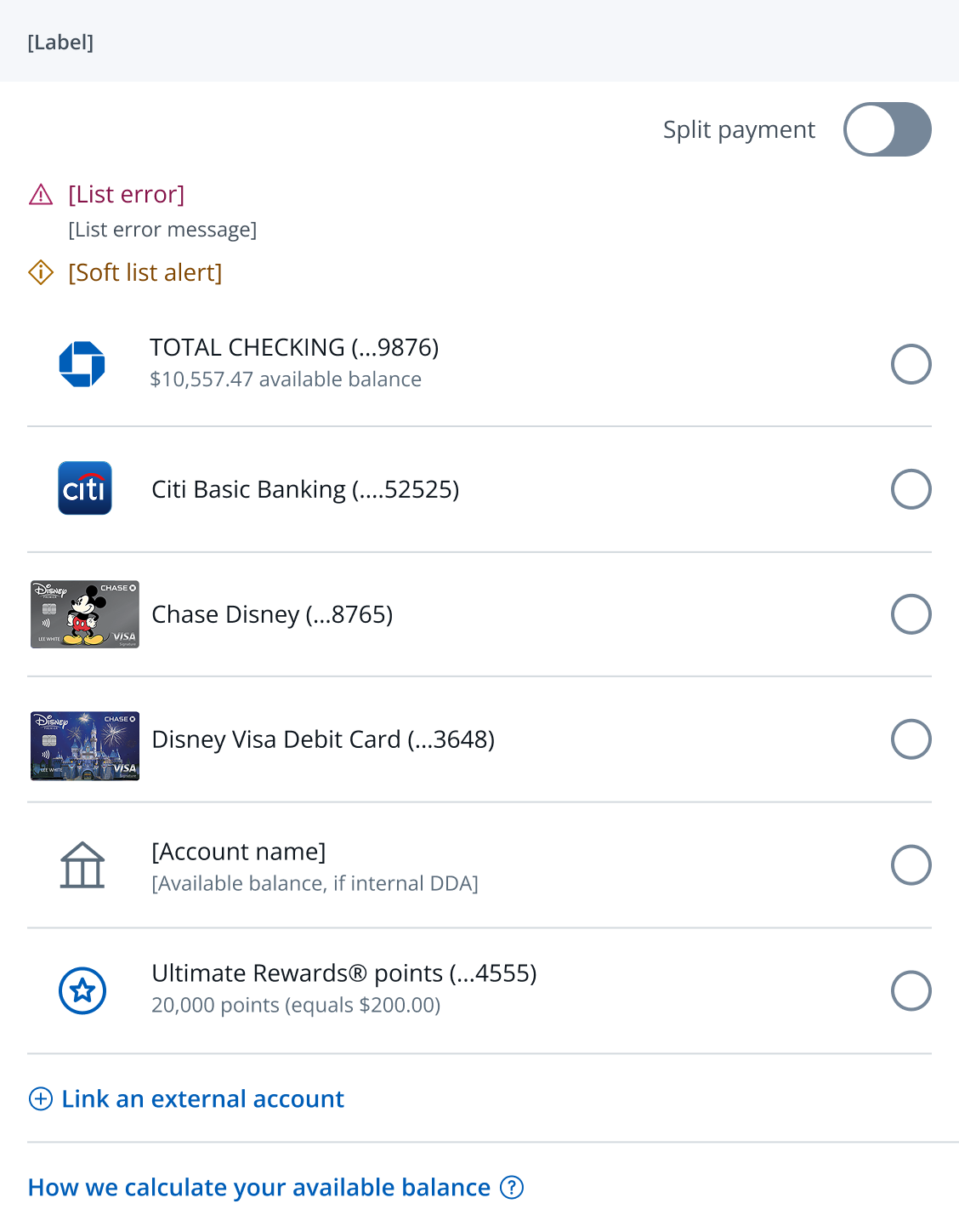
| Categorization | No cagegory, Categories on the MoPs | Optional categorization |
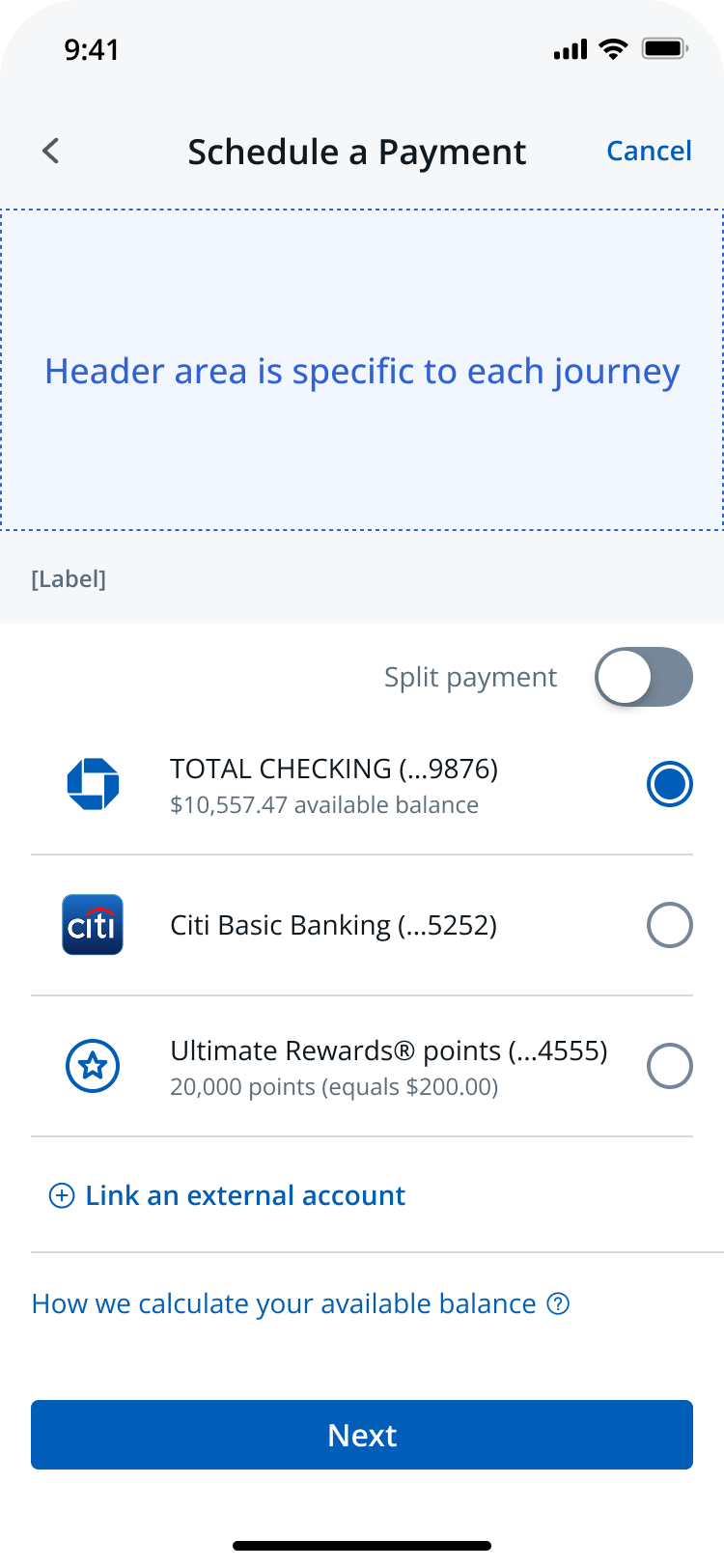
| Link External Account | Button & 12px padding at the top, Padding reduced to 4px, Link an external account with supplemtal link | Supplemnental link |
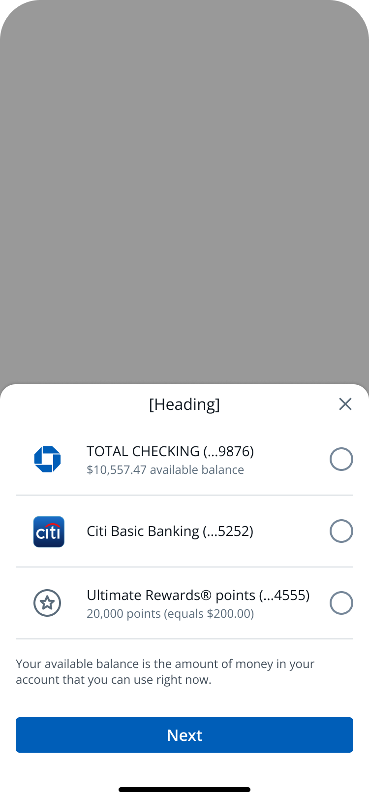
| Available Balance | Popover, Reduced padding & Upladed to Flyout, Static text with shorter content, Contextual Help Flyout for available balance | Contexual Help or read-only content area for definition |
The breakthrough wasn't finding the "right" answer — it was structuring a conversation where twelve teams could discover the answer together.
With a shared understanding of the context and a solution that could scale, the design work shifted to the specifics — getting each of the four decision points right at the component level.
SafePay shipped as a coherent, consistent experience across all payment journeys — not because every team was forced into compliance, but because they co-created the standard together.
The process we built didn't just solve SafePay — it gave the PDL teams a reusable model for making cross-functional design decisions at scale.
SafePay's internal audit gave us a strong foundation, but it could only show us what we could see from the inside. Sitting with journey teams and understanding their specific contexts surfaced gaps and constraints that no self-directed audit would have caught. The biggest lesson: the people closest to the problem always know something you don't.
Alignment didn't happen because we had the right answer — it happened because teams felt heard. When we named what SafePay offered and why it was designed the way it was, journey teams stopped treating it as an imposition and started treating it as a shared resource. That shift — from compliance to ownership — is exactly what trust looks like in a design system context.